BeSo chic. BeSo organic. BeSo YOU. ...thoughts on design, fresh interiors + style from a photo stylist.
Showing posts with label Set Styling. Show all posts

Tuesday, May 2, 2017

#shelfie 101 : styling tips

In the age of the Selfie, we design-obsessed have a version all our own ... the Shelfie. Oh how we love a perfectly styled shelf. 

What is it about a well-designed etagere or bookcase? Is it the sense of order, the pretty mix of layers + textures? What draws you in?

I admit it, I'm guilty. Every time I see Emily Henderson's freshly styled bookcases, I'm inspired. Granted, I'm a photo stylist. These are the things we live for... to style, decorate, accessorize. Give me an empty bookshelf any day, and I'm ready to dig in and style away. Call me crazy, but styling a shelf is my kind-of fun!

I just recently teamed up with two amazingly talented women, Kelley Vieregg of KVID {Interior Design} + Emily Decker of EA Decker Photography. We were on location in the Charlotte area, in a fabulous kitchen designed by Kelley. I had the chance to add a few styling touches, and Emily captured it all in beautiful images. 


Shelf Styling


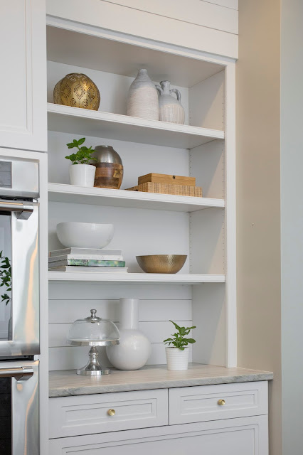
White Kitchen, Design by Kelley Vieregg of KVID Interior Design. Photography by EA Decker Photography.

A killer kitchen, right? I mean, this is what dreams are made of (especially for those of us who adore an all-white kitchen).

I so love collaborating with other creatives. I had such a sense of girl power with this shoot. These lady bosses have got it going on. So much talent, style + creativity.

This brief shoot has me craving more opportunities to style, play + collaborate. I also wanted to share a few behind-the-scenes shots and use this opportunity to share some styling insight. A mini Shelfie Styling 101.

I know there are plenty of tips out there for styling a beautiful shelf (like this one from Em Henderson + this one from Design Sponge), but I wanted to give you my spin on the subject. The first step with styling a shelf is to clear it of everything. That's right, take it all off. Start with a clean slate, and then start building with books + props.  I typically love adding artwork into the mix, but this time kept it super clean.


Bookshelf Styling by Patti Borrelli, BeSoStyle blog


Here are a few Quick Tips 
for Styling a Simple + Chic Shelfie:

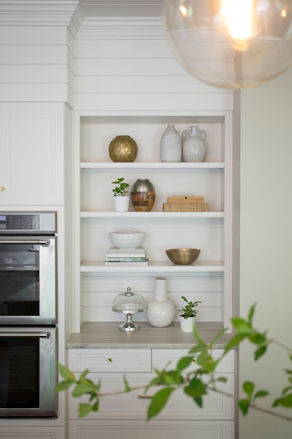
1. Balance the elements. When styling shelves, it's all about the balance. You want to balance the colors and weight of objects. For this one, I kept the color palette fresh + clean since the shelf resides in an all-white kitchen. I wanted to carry that white-on-white look throughout. I chose to balance the whites with metallic accents and added a few natural textures, like the raffia tray ... making sure the right and left side of the shelf got equal love with pretty white shapes.


Shelf Styling Tips by Patti Borrelli, BeSoStyle blog


My goal was simple + clean. Of course you can always add more props + layers. 

Here is where I started...

White Kitchen, design by Kelley Vieregg. Photography by Emily Decker.

The balance was off for me. Sometimes you don't know until you start to play with the arrangement. I didn't like the groupings right on top of one another and needed to balance the shapes and colors a bit.  Just a few tweaks + edits ...

Photo Styling by Patti Borrelli, BeSoStyle blog

...and I liked the fresh result...


white kitchen, shelf styling, bookshelf styling, shelfie, white design


2. Keep the mix simple. I love a layered shelf with a mix of bohemian, eclectic elements, full of color + texture... but sometimes with shelf-styling, less is more. Streamlining the color scheme to a blend of two or three colors keeps the look fresh and gives the eye places to focus and places to rest.

white and metallic bookshelf. styling by Patti Borrelli. Kitchen design by Kelley Vieregg. Photo by Emily Decker.


3. Add something organic. In this scenario I mixed in fresh potted herbs since these shelves are in the kitchen. Plants like succulents are perfect for shelves because you don't have to water as frequently. You can also opt for adding organic shapes like driftwood or coral...or cut a fresh branch or two from outside and place them in a vase or jar (like I did for the kitchen island).

White shapes, white style, bookshelf styling, kitchen shelves


White Kitchen, Design by Kelley Vieregg, KVID Interior Design. Photography by Emily Decker, EA Decker Photography.

... Here's a glimpse from behind the scenes in this stunning kitchen, design by Kelley Vieregg, KVID {Interior Design}. Photo by Emily Decker of EA Decker Photography.


I hope you enjoyed this mini lesson in shelf styling. Share your secrets with me too + be sure to comment. I love hearing from you.

xo


patti


Friday, February 3, 2017

la - la - luscious interiors

I told you we were working on something really fun! 
...and now here it is, just in time for the weekend... the big reveal!

My set decorator sister Pam has pulled together a stunning + oh-so-captivating post, with loads of brilliant thoughts + insights into the cinematic enchantment + allure of La La LandSo...Get ready for some La-La-Luscious Ideas + Inspiration.


Read on, scroll down...
I promise you won't be disappointed. Here's Pam's take on La La Land, from set design to real-life interiors...

* * *


FOR THE LOVE OF SET DÉCOR


If you're a film enthusiast like me, you can't help but be swept up into the excitement and buzz of the official award season. The Golden Globes kicked off the La La Land craze.  Now the frenzy continues with the film’s fourteen Oscar nominations. After seeing the film, I am happily twirling my way onto the bandwagon. Seriously, I cannot wait until spring, so I can slip into a colorful, flouncy dress and dance into the sunset.


Inspiration from the Set Design of La La Land
 {Emma Stone’s canary yellow dress looks stunning against the backdrop of a purple-blue haze. 
Image via The New York Times.}


Inspiration from the Set Design of La La Land
{Production Designer David Wasco + Set Decorator Sandy Reynolds-Wasco created Hollywood dream sets, Image via Forbes.}

Before re-locating to the Midwest, I worked as a Set Decorator, both in New York and LA. Seeing La La Land reminded me of what I love most about the film industry: the magic of each person, cast + crew, doing their part to create the bigger picture.  There's something intoxicating about the movies, isn’t there? And, there is something about those dreamers, those artistic souls who are drawn to the creative chaos.


“Here’s to the ones who dream
Foolish as they may seem
Here's to the hearts that ache
Here’s to the mess we make.” 
Lyrics from Audition 
(The Fools Who Dream)
La La Land


Emma Stone on set of La La Land
{Image via Vogue}


Set Design for La La Land
{Image via The New York Times}

I remember working on the Universal Studios lot, soon after moving to Los Angeles. I was riding in one of those golf carts, running set errands and I had to call my Mom. I was “Living The Dream,” as we called it behind the scenes (“LTD” for short). Of course, we mostly used the term jokingly, while doing something glamorous, like mopping the stage floor.

The other aspect I enjoyed about film decorating was “breaking down the script,” set by set. This is when I’d read through the script with a fine-tooth-comb, in order to get to know the characters and to start dreaming about the world(s) we would create for each character.

As a decorator, I was thoroughly inspired by all of the visual eye candy of La La Land. Here are a couple of cues from the big screen to ignite a little Hollywood magic into your world:


Magic Hour Lighting


You know what they say, “It’s all about the lighting.” Cinematographers call the best time to shoot “magic hour.” It's the period shortly after sunrise or before sunset, when the sky has softer hues than when the sun is shining high in the sky. This film found its' color palette in twilight skies. 

On the Set of La La Land
{Image via Cosmopolitan}

You can create this same subdued sunset effect on your walls with an ombre wallpaper (or d-i-y the look with paint. Find a great how-to here).


Ombre Walls with Ombre Wallpaper
{Image via Murals Wallpaper}

Or, you can live the La La dream just by using the "magic hour" filter by A Color Story. Get the app for your smart phone and have some fun editing your images and creating some magic of your own. Here's a fun post by A Beautiful Mess with more info and images for inspiration. Print and frame a magic hour- edited photo of your own or post one on instagram to live that La La vibe.


A Starry Night Sky = Drama

La La Land also used the beauty + twinkle of starlight with abandon on their magical sets. 


Starry Night on the Set of La La Land
{Image via Casa Vogue}


You can replicate the look too. Try painting a ceiling in your favorite hue of deep blue, or even black. And make sure to light it up with a twinkling light fixture for instant romance.

Modern Light Fixture and Deep Blue Painted Ceiling

Modern Light Fixture Statement and Painted Black Ceiling
{Via My Domaine. Photo by 47 Park Avenue.}


Pay Homage to Classic Hollywood Graphics

I loved how the production design team of David and Sandy Reynolds-Wasco used bold graphics + hints of art deco to pay homage to classic Hollywood glamour.  
Set Design for La La Land
{Image via Architectural Digest
A great article for more behind the scenes scoop.}


Get the look. Adorn a wall with a large scale, vintage cinema poster like the one of Ingrid Bergman, used above Mia’s bed.


Graphic Hollywood Movie Prints : Audrey French Poster
{Image via sfgirlbybay}

A while back, I laid my eyes on this Audrey Hepburn poster from the French version of Funny Face. I’ve been searching for an actual vintage French poster and have yet to find one within my budget. To find similar replicas, you can go to amazon or etsy. Or, find an array of Hollywood inspired art here.


{Link here to purchase the poster via Amazon}


(Link here to purchase this poster via Etsy}

Enlarge a vintage advertisement or postcard to create playful wall decor. You can easily create your own work of art through Shutterfly.

Ryan Gosling on the Set of La La Land
{Image via Forbes}

Graphic Vintage Fruit Advertisement Poster
{Image via pinterest.  Fruit crate label photo by Paul Malon on Flickr.}


Technicolor Jazzes Up A Neutral World


In the first act of La La Land, you’ll notice a distinct difference between Mia’s colorful world and the sparse, colorless world of Sebastian.  That is until they meet, of course.  Mia puts the color inside of his world (I hear a John Mayer song).


Emma Stone on the Set of La La Land{Image via The Guardian}


You can color your interiors with splashes of vibrancy, with a statement chair in a rich tone or colorful pillows, like this example of an essentially neutral space enhanced with black-and-white and a few vivid pops of color.


Colorful Hollywood Glam Interior Design
{Image via pinterest.  Jonathan Adler, an amazing source for all things technicolor and dreamy!}


When in Doubt, Just Add Stripes 


I completely fell for the striped sofa in Mia’s original L.A. apartment set.  Stripes are classic and once again, give a nod to old Hollywood.


Striped Sofa from the Set of La La Land
{Image via  Vogue}

Audrey Hepburn Black and White Hollywood Photo : Striped Sofa
{Image via pinterest. Find the original Photographer's archive here, scroll to Leading Ladies to find Audrey}

Black and White Striped Sofa and Gallery Wall Inspiration
{Image via pinterest/thirlby tumbler}

Black and White Rug and Teal Sofa Interior Design
{Image via theROOMedit}


How about you, which look do you want to emulate in your home?  Isn't it amazing how much inspiration can be found in one extraordinary creative collaboration.  Don't you think life should be a little more like the movies?  I mean the good stuff: more magic hours, more romance, more heartfelt moments + more dancing under the stars.  If you haven't seen La La Land yet, promise me you will before Oscar night!  

xo,

pam


{Here we are in real-life #MagicHour in LA}


Wednesday, October 30, 2013

purpose statements + styling ideas

I've been thinking about my purpose for this blog and what I hope it inspires for my readers. When I initially came up with the concept of BeSoStyle (named in honor of my daughters Bela & Sofi, the next generation of Sisters of Style), I had been a blog reader for a while. I thought that as a photo stylist I might just have a unique voice in this big world of design bloggers.  I still feel like a dabbler at this point, still trying to get my head around how in fact to make it a business. I am so open to direction, suggestions, advice (Feel free to contact me and guide away).

Thanks to the successful + inspirational blogger the nester I decided to develop a purpose statement. See this link for her advice on developing a blog purpose.

As I was developing my purpose statement I realized what I haven't done enough of ... and that is share design ideas I've learned or had the gift of being able to execute as a stylist. Here are some of my thoughts on creating fresh design (by showing you some of my favorite images I've styled through the years)...
{Photographed by Kenton Robertson. Styled by Patti Borrelli for Belle Meade Signature.}
I love, love luxe, light neutral shag rugs. They always add instant luxury, texture and warmth. I'm also a fan of collections of shapes like the hint you see in the mirrored headboard. And I adore neutral, natural, textured linens like my favorite, this pintuck duvet from west elm. Plus, pink, always = pretty.

This is the real-life use of my fave duvet in my guest room...


...and more styling images that show how a richly textured neutral rug works perfectly for creating a fresh space. 


{Photography by Kenton Robertson. Styled by Patti Borrelli for Harden Furniture.}


 Also, notice how an oversized frame becomes art, and how the collection of shapes + hints of nature add visual interest.

(...here are those same fabulous jonathan adler vases on my fall mantel last year...)

jonathan adler white vases


{Photographed by Kenton Robertson. Styled by Patti Borrelli for Belle Meade Signature.}

Layers of Art always work.   You can create your own art with a little creativity. See a few of my diy art ideas here.


White or neutral draperies, especially natural sheers are a go-to in styling (One of my favorite resources for beautiful Belgian linens is Restoration Hardware.) Here, sheers work as a luminous room divider to create a workspace (click here for more b+w chic images)


 ...and create a perfect neutral backdrop for this coastal-inspired dining room (more on coastal styling here)...


west elm capiz chandelier

{The two images above were styled by me for Stanley Furniture. Photography by TTW Photo.}


... just a few design thoughts to hopefully inspire.

As for my blog purpose ... here's what I came up with...


Purpose Statement:
{For readers-}
The aim of BeSoStyle is to create a source of inspiration for design + style-minded readers.  Through fresh images + styling hints, I hope to motivate readers to style something a little differently in their home, do a simple DIY project or put together an outfit in a fresh way.  Small changes that build confidence + creative satisfaction. 

My signature style incorporates natural elements to create an organic feel.  I’d like to inspire others to bring instant beauty to their homes by borrowing from nature, adding natural textures + shapes.

{For me-}

BeSoStyle is my field of dreams. A place I get to share my inspirations-of-the-day. Inspirations for interiors + fashion.  And a place I share a “behind-the-scenes” look at my styling gigs, from the concept phase...through prop shopping, DIY creation, set decorating and completion of a photo shoot or visual display project.

My ultimate purpose for the blog is to make it profitable…which will allow me to better balance family, home and career.
I welcome your feedback and thoughts. Wishing you a wonderful week!

xo

patti

Tuesday, August 27, 2013

styling lately

School is back in session.  Fall is practically upon us.  And I am motivated anew to re-organize and refresh. How about you?

I've been guest posting over at Young America recently. See here for my post on back-to-school style tips (inspired by my teen girls).


I also had a photo shoot this month and was able to style a few fun vignettes.  Here are some of my favorites...


We shot these images for Young America with Diana Parrish Design and Photography. I love the light in this shot...and of course that gorgeous chandy I found at Home with Heart in Charlotte (a great shop for one-of-a-kind interior finds).

 ...an instagram close-up of the chandy candy...
A fresh desk vignette because we all like to at least pretend we have organized desks and live orderly lives.
I styled this room with classic childhood nostalgia like the slinky + striped straws + Crayolas + bubblegum balls (more on decorating with candy here).  Plus the fun + color of handmade paper streamers. I found these shape streamers via etsy. I think they are perfect for a kid's space or any festive occasion. I'm always up for any excuse to throw a party.


I wrote more about this bohemian-inspired room set here.  FYI: Some of my fave prop shopping stops for creating a boho vibe are Anthropologie (yarn spools), World Market (votives)and Pier 1 (pouf).


Please let me know what you think of my most recent styling work. I love hearing from you!


Wishing you a colorful week!


xo


patti


Friday, September 14, 2012

diy: paint swatch art

Another styling opp turned craft project. I love styling photo shoots of kid's rooms + crafting fun decorative ideas you can do with your kids. This time I wanted to try my hand at paint swatch art.  I had seen some ideas online, but wanted to do my own interpretation.

I picked the colour palette based on the linens selected for the bedroom suite, eastern accents "Matilda" bedding ...shades of coral, aqua & teal.  


I wanted to juxtaposition a modern, abstract piece of art with a vintage frame. To add additional visual interest, I mixed in other vintage frames for a layered look.

Here's how it turned out...


{Photographed by diana parrish photography & design for young america ; Paint color is Coral Gables by benjamin moore }


There's really not much to the "how to."  Simply start by picking up paint swatches from your local paint or hardware store.  I used a piece of foam core that fit into the frame as a base. 

I layered the swatches over one another to conceal the paint names on the cards.  I played around with different configurations...& once I was sure of my design, I began to double-stick tape the swatches onto the board. An original composition in no time.

Pretty cool, right? Practically free art. 


There's lots of fun ways to use paint swatches.  Here are more ideas...


{shapes}

{via bluevelvetchair.blogspot}


{gift wrap}


{via atypicaltypea.com}


...and some pretty coral + aqua flowers to take you to a happy place...


 {via ellabellafloral.blogspot.com}

{the above images are "likes" on my pinterest page to see the original sources... pinterest-BeSoStyle}

ps. you may also like another recent DIY post, sun prints. 


Have a great weekend!

patti