BeSo chic. BeSo organic. BeSo YOU. ...thoughts on design, fresh interiors + style from a photo stylist.

Tuesday, September 25, 2012

location scouting

One of the perks as a stylist is working in, and discovering, really amazing locations. I admit, one of the drawbacks is the jealousy that may set in on occasion (like this time).

Monday I was scouting locations in Charlotte with photographer Kenton Robertson.  He had come across this gem online...& we were lucky enough to see it live & in person...


Yep, I fell in love.  Wow! Stunning.  And not in an over-the-top, glitzy kind of way... but in a very current, fresh, re-purposed, aah-inspiring kind of way.


It was just my colour palette.  Lots of white with pops of turquoise.  Lots of reclaimed, raw wood. Layers & layers of coolness. Barn doors, great floors, rich textures.


I can't resist, I have to share a few quick scouting snaps.


Be Inspired too!


{LOVE the Pendant Lights & Turquoise Vessels!}


 {Re-claimed wood-turned vanity &
Re-purposed shutters-turned-closet doors. LOVE!}


... & a close-up made a little prettier with instagram...


Hope you enjoyed the quick tour.

Getting ready for a shoot next week...Painting begins today. 

More soon.

xo

patti


Friday, September 21, 2012

butterfly chair love

BeSo retro. BeSo fresh.
Butterfly chairs add geometric shape and an easy, laid-back, carefree feel.  Maybe it's my love for that boho vibe...but I heart the butterfly chair.

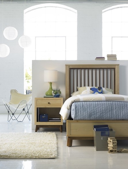
We bought one for this young america photo shoot at urban outfitters in natural canvas... of course it rocks in this amazing loft space...


butterfly chair
{I styled this room for young america ... using chair from urban outfitters and paper lanterns from ikea. locker bin & wooden game from target
Photography by ttw photo.}

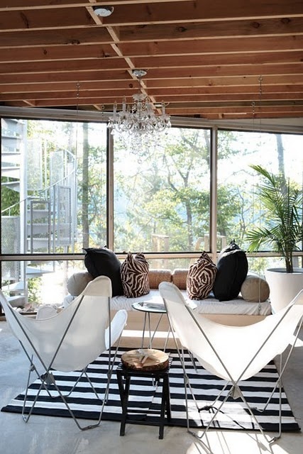
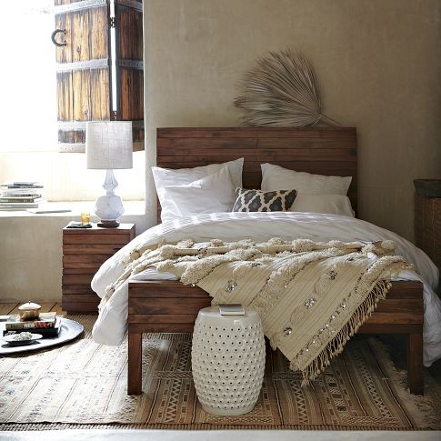
While fixating on the topic of butterfly chairs and all things chic, I fell in love with these inspirational images of amazing indoor & outdoor living spaces...


fresh interiors
{via the decorista. i love the translucency of the chairs & chandelier combined. perfection.}


teen room
{don't you just love the lighting of this shot? this is via pbteen .}


butterfly chairs
{via houzz. i always love the freshness of white outdoors or in.}


...& a little bohemian fashion inspiration...


{via lookbook.nu}

{via 30.media.tumblr}


Happy Friday! Happy Weekend!  Add a little style to your day. 

xo

patti

Tuesday, September 18, 2012

layers + layers


Fall always brings to mind dressing in layers.

I personally love the look. Layers of luxe.
I also love layers when it comes to interiors. 
I just saw one that was particularly inspiring
this past weekend. 
Check it out...


{Apartment of textile expert Mary Nelson Sinclair via timeout.com
timeout.com/newyork/style-design/apartment-tour-1br-in-the-west-village-1}

Don't you just love the layers? Layers of art, texture, colour, style.


{...thanks Coby @orangecashmere for the link to this very cool interior.  Visit her blog, orangecashmere.blogspot
 

Layers add depth, richness, interest, personality, warmth & texture.

...Here are a few more layers of layers to inspire...


{via anthropologie}


{via decor8}


{via the style files}


{via Lonny Magazine Sept/Oct 2011; design by Lisa Sherry}
Love her blog too, lisasherryinterieurs


{via rue hampden}

Have fun layering your self & your spaces!

patti

{All images above via pinterest-BeSoStyle}

Friday, September 14, 2012

diy: paint swatch art

Another styling opp turned craft project. I love styling photo shoots of kid's rooms + crafting fun decorative ideas you can do with your kids. This time I wanted to try my hand at paint swatch art.  I had seen some ideas online, but wanted to do my own interpretation.

I picked the colour palette based on the linens selected for the bedroom suite, eastern accents "Matilda" bedding ...shades of coral, aqua & teal.  


I wanted to juxtaposition a modern, abstract piece of art with a vintage frame. To add additional visual interest, I mixed in other vintage frames for a layered look.

Here's how it turned out...


{Photographed by diana parrish photography & design for young america ; Paint color is Coral Gables by benjamin moore }


There's really not much to the "how to."  Simply start by picking up paint swatches from your local paint or hardware store.  I used a piece of foam core that fit into the frame as a base. 

I layered the swatches over one another to conceal the paint names on the cards.  I played around with different configurations...& once I was sure of my design, I began to double-stick tape the swatches onto the board. An original composition in no time.

Pretty cool, right? Practically free art. 


There's lots of fun ways to use paint swatches.  Here are more ideas...


{shapes}

{via bluevelvetchair.blogspot}


{gift wrap}


{via atypicaltypea.com}


...and some pretty coral + aqua flowers to take you to a happy place...


 {via ellabellafloral.blogspot.com}

{the above images are "likes" on my pinterest page to see the original sources... pinterest-BeSoStyle}

ps. you may also like another recent DIY post, sun prints. 


Have a great weekend!

patti


Wednesday, September 12, 2012

work space inspiration

OK, It's not exactly spring, but I need to do some serious office cleaning & re-arranging. This is my current wall of inspiration...


It includes pics of some of my favorite places, like Paris & the beach. And my favorite people, my husband & two daughters.  It highlights some of my loves, like dance, dragonflies & art...& my go-to quotes for inspiration..."go confidently in the direction of your dreams."  And of course, overflowing are many of my fave styling tear-sheets from magazines & catalogs to inspire me.

But...I desperately need to update my board & re-vamp my office.  It has become the dumping ground for all unwanted, unidentified items (you know the drill).

To get me motivated, I found a few images of inspiration to kick into gear my office re-do.

I hope to emulate the vibe of these dreamy spaces...

{via matissecolor.blogspot}

{via Lonny June/July 2012}

{via The Design Files}

{via dustjacketattic.blogspot}

{via littlebitsoflovely.blogspot}


{all images above are on my "work it!" pinboard pinterest-BeSoStyle}


...And here are some work spaces I've styled for shoots.  Perhaps I can steal an idea or two from my own creations as well...

desk
{I love the gray wall colour, the graphic b+w art & the fresh coleus stem.  This was shot for the stanley furniture Archipelago Collection by kenton robertson}

home office
{I especially like the ampersand from anthropologie...the series of b+w Paris photos & the collection of architectural drawings...this was shot for Stanley's Avalon Heights Collection by kenton robertson}


{I love this detail of the groovy little chair sculptures, thanks to amazing furniture designer John Black, jblackdesign}

...So, here's to motivation & determination.  I need to get psyched and dig in. I'll show you how it turns out (eventually).

What's your nagging project? Do tell.  I'd love to know I'm not just sending this out to the great void.  Hope this blog motivates someone else to bring a little more style to their life too.

patti


Saturday, September 8, 2012

fall = cozy

September equals the entree of fall. And though the temps are still high here in the Carolinas, I'm thinking of cozy fashions & interiors.

(secretly wishing I was taking in runway shows in NYC after seeing all the fashion week tweets)


...here's a few pretties to ponder...


{via figleaffashion.blogspot.com}


{Via West Elm}


{Via Lisa Sherry Interieurs}


{All images are on my "street style" & "interior inspirations" pinboards}


Happy Weekend!

xo

patti


Wednesday, September 5, 2012

diy: sun prints

I recently styled a photo shoot for Young America, highlighting new additions to their "My Haven" youth bedroom furniture collection. 

I wanted to add some DIY decorative accents to the room scenes to inspire parents + kids to create their own one-of-a-kind decor.


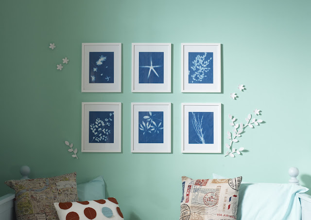
So... to create an inspirational room for a sun-loving teen girl, I started by selecting a color palette of sea blues + greens...then I crafted some sun prints using elements from nature & sun print paper like this Sun Print Kit from Amazon (click here for the link).


Here's the finished result of my sun print crafting + on-set photo styling...


Click here to get your sun print paper to make your own...


Sun Print Paper
{link here to get your Sun Art Paper on Amazon}


solar prints

I framed the prints in white and added some dimension by incorporating umbra Loft Twig Wall Art purchased at Target (you can find umbra wall flowers here). I also added beachy elements + a surfboard. The walls are painted in benjamin moore Sea Mist Green.


sun prints
{The completed room...Cool for any surf-lovin' girl.}
{Styled by patti borrelliphotographed by diana parrish photography & design


The DIY how-to:

The sun art kit came with easy step-by-step instructions.  My first attempt flopped, but after reading the directions a little more carefully (& listening to my daughter's advice) I went to a "dark room" (my pantry) to place the items on the sun print paper & cover with the acrylic sheet.  I chose natural items like sea-stars, shells, stems & flowers. Then, I placed the paper in the sun for 5 minutes, removed the items & rinsed paper in cold water with a little lemon juice ... & wallah... magic.  The images appeared, crisp & clear.  I love the deep indigo color & the wispy shapes the branches, leaves & flowers create.

Here are some shots of the sun prints in the making...


first attempt failed. images were very faint.


solar prints sun prints DIY

2nd attempt- Success! images sharp & artful.


More detailed steps are posted on the young america blog.


...Here are two more images I found that show even more ways to display your very own DIY sun prints...

{via sweetpaulmag}


{via apartment therapy}


Here's to sunshine + more fun DIY projects on the horizon.

xo

patti