BeSo chic. BeSo organic. BeSo YOU. ...thoughts on design, fresh interiors + style from a photo stylist.

Tuesday, December 3, 2013

secrets from a stylist: MIX IT UP!

Hi all!

Today, I'm handing it off to a special guest blogger...my twin sister Pam Stasney.  She too is a photo stylist {+ set decorator}.  She has designed sets for film, television + more...in NYC + LA...and has currently landed in Milwaukee. She was recently featured in the December issue of M Magazine: Milwaukee's Lifestyle Magazine {click here to read the full article.}


Take a peek at some of her interior spaces + listen to her insights into interior styling + design.  Here she is...


{Pam Stasney, as seen in M Magazine December 2013.  Photographer: Dan Bishop. Sources: Sofa from Architexture Home (Studio City, CA),Baker Chair designed by Barbara Barry and found on Craigslist, Sunburst Mirror from Plantation Home Los Angeles, Throw pillows from OneKingsLane, allmodern, etsy and Target. Area rug designed by Dwell and available at McNabb & Risley.  Turquoise Lamps from Target, White Ceramic Pagoda from Design Xchange, Pewaukee, WI.}


With years of experience decorating sets for film and styling photographs in New York, Los Angeles, Chicago and now Milwaukee, I have learned a few trade secrets that I'd love to share with BeSoStyle readers.


First and foremost. It's all about mixing it up!


Mix High + Low


Ok, I admit, I have expensive taste, far beyond my budget.  I've learned that if you splurge on one or two statement pieces, you can supplement with bargain finds, without sacrificing style. 


In my office, I have a high-end, antique desk from a movie set I decorated (one of the perks of working in the film industry). 


{Pam Stasney Style Office.  Photographer: Dan Bishop.
As seen in M Magazine, December 2013.}
...but, my desk chair is a bargain find from Marshalls, designed by Cynthia Rowley.  Ikat pillow from OneKingsLane (an amazing resource).  And the stunning brass étagère is a second-hand find from Designer Consigner in Hartland, WI.

Another great way to MIX IT UP...


Mix Old + New

When I’m creating a lifestyle set, whether for photography or film, my goal is to create a space that feels collected over time.  Mixing vintage pieces with more modern elements makes the movie magic happen.  In my office, I created a gallery wall over my desk, a chic way to display a collection of art.  In the gallery, I have some cherished heirloom pieces:  an abstract painting from my Dad (Dancing Rainbow) and a small watercolor painted by my mother-in-law.  Alongside these heirloom pieces, is a mixture of contemporary art creations: a fine art print from my husband (Butterfly Peonia by Jeff Stasney), a graphic Golden Retriever Silhouette from Mod Dog/etsy.com, Fruit of the Spirit Print from Olive Manna, Spin Art from a friend (I just love kid’s art) and a DIY project I created on a whim.


Mixing old with new works when styling your bookshelves too.  Intermingle interesting objects alongside your books to keep it visually intriguing.


{Pam Stasney Style Office, Etagere Detail.  Photographer: Dan Bishop}

Mix Neutrals + Patterns


A neutral base is timeless and opens the way for color flexibility.  For my interior design clients, I usually recommend neutral colors and great textured fabric for the cornerstone pieces of a room. My sofa is a deep neutral grey.  Because I’m a California girl (at heart), my color accents are primarily the colors of sun and surf.  It’s what makes me happy.  With a neutral base, you are free to change up your throw pillows with colors and patterns to suit your mood-of-the-moment.  Simply changing the accessories can create a whole new feeling in your space, without having to spend a lot.


Before you begin your design project…

Create a Mood Board for Inspiration.


Here's mine for my office space...


Creating a mood board is definitely something I’ve learned from my work in film and photo styling.  Whenever I am creating a space or story, I first gather inspirations: fabric & wallpaper swatches, paint chips, objects of nature, interior or fashion photos that have a certain vibe, a piece of art, an architectural element etc…As you gather, see how it flows.  You will be able to edit and refine as you narrow down the feeling you want to create. 


When it comes to your personal space, surround yourself with colors and things that make you happy.

pam


Wednesday, October 30, 2013

purpose statements + styling ideas

I've been thinking about my purpose for this blog and what I hope it inspires for my readers. When I initially came up with the concept of BeSoStyle (named in honor of my daughters Bela & Sofi, the next generation of Sisters of Style), I had been a blog reader for a while. I thought that as a photo stylist I might just have a unique voice in this big world of design bloggers.  I still feel like a dabbler at this point, still trying to get my head around how in fact to make it a business. I am so open to direction, suggestions, advice (Feel free to contact me and guide away).

Thanks to the successful + inspirational blogger the nester I decided to develop a purpose statement. See this link for her advice on developing a blog purpose.

As I was developing my purpose statement I realized what I haven't done enough of ... and that is share design ideas I've learned or had the gift of being able to execute as a stylist. Here are some of my thoughts on creating fresh design (by showing you some of my favorite images I've styled through the years)...
{Photographed by Kenton Robertson. Styled by Patti Borrelli for Belle Meade Signature.}
I love, love luxe, light neutral shag rugs. They always add instant luxury, texture and warmth. I'm also a fan of collections of shapes like the hint you see in the mirrored headboard. And I adore neutral, natural, textured linens like my favorite, this pintuck duvet from west elm. Plus, pink, always = pretty.

This is the real-life use of my fave duvet in my guest room...


...and more styling images that show how a richly textured neutral rug works perfectly for creating a fresh space. 


{Photography by Kenton Robertson. Styled by Patti Borrelli for Harden Furniture.}


 Also, notice how an oversized frame becomes art, and how the collection of shapes + hints of nature add visual interest.

(...here are those same fabulous jonathan adler vases on my fall mantel last year...)

jonathan adler white vases


{Photographed by Kenton Robertson. Styled by Patti Borrelli for Belle Meade Signature.}

Layers of Art always work.   You can create your own art with a little creativity. See a few of my diy art ideas here.


White or neutral draperies, especially natural sheers are a go-to in styling (One of my favorite resources for beautiful Belgian linens is Restoration Hardware.) Here, sheers work as a luminous room divider to create a workspace (click here for more b+w chic images)


 ...and create a perfect neutral backdrop for this coastal-inspired dining room (more on coastal styling here)...


west elm capiz chandelier

{The two images above were styled by me for Stanley Furniture. Photography by TTW Photo.}


... just a few design thoughts to hopefully inspire.

As for my blog purpose ... here's what I came up with...


Purpose Statement:
{For readers-}
The aim of BeSoStyle is to create a source of inspiration for design + style-minded readers.  Through fresh images + styling hints, I hope to motivate readers to style something a little differently in their home, do a simple DIY project or put together an outfit in a fresh way.  Small changes that build confidence + creative satisfaction. 

My signature style incorporates natural elements to create an organic feel.  I’d like to inspire others to bring instant beauty to their homes by borrowing from nature, adding natural textures + shapes.

{For me-}

BeSoStyle is my field of dreams. A place I get to share my inspirations-of-the-day. Inspirations for interiors + fashion.  And a place I share a “behind-the-scenes” look at my styling gigs, from the concept phase...through prop shopping, DIY creation, set decorating and completion of a photo shoot or visual display project.

My ultimate purpose for the blog is to make it profitable…which will allow me to better balance family, home and career.
I welcome your feedback and thoughts. Wishing you a wonderful week!

xo

patti

Tuesday, October 22, 2013

white pumpkins + feathers

Just got back from High Point, designing furniture showrooms in time for Fall Market {#HPMKT}.  Now I'm ready to style some of my own finds + creations. Here are a few of my recent instagram images to let you know what's been on my styling-obsessed mind...


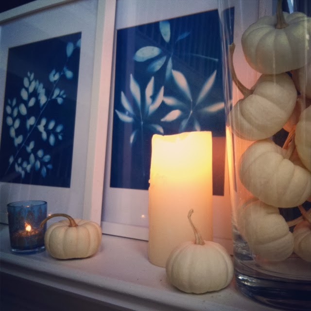
fall mantel

...had to get a collection of these sweet white pumpkins when I spied them at the local farmer's market.

fall mantel


Together with my handmade sunprints (see here for my diy how-to.) they make-up my fall mantel. Of course, candles go with everything...


...and then there's my recent obsession...with FEATHERS!...


...these are my instagram snaps of feathers in the morning light and feather on snakeskin (box by Nate Berkus for Target)...


I have been pinning images, like these...


...and getting inspired to do something creative with feathers.  As often happens, I came across a blogger who had already done what I had been thinking of, and oh so well (see here for her how-to for framing feathers as art)...


{image via city farmhouse}

...and lastly, please visit the youngamerica blog for my latest diy: bohemian-inspired trays with mod podge and world market papers (I love how the trays turned out. let me know what you think)...


Hope you are having a good October. Fall is going fast...so seize the warm sunny moments and the chances for fireside chats with close friends. 


xoxo


patti

Thursday, September 12, 2013

coral crush + etsy love

So...I have big news!
My sister (twin) in real life and in styling just opened up a little etsy shop of her very own. 

As you may have gathered from previous posts, I am a huge fan of etsy, and often use it as a resource for styling gigs. I adore the handmade, unique quality of etsy finds.


My sister Pam {pamstasneystyle} is an experienced set decorator + stylist and has curated quite the collection of beautiful, artful items. Style Studios showcases props she's used on film sets and discovered on her travels + prop-shopping adventures.


Feel free to re-pin my pin which links directly to her shop...or just go straight there...


Seriously, check it out. There are some amazing finds at Style Studios. Use coupon code BESOFRIEND to get $5 off your purchase through the weekend.

In addition to announcing the new shop, I also wanted to share a few images of inspiration. My current colour crush is coral, that delicious mix of pink + orange. So fresh + inviting. Take a peek at some of these inspiring hints of coral-from blush to bold...

{image via ingerstedt-elle deco Sweden}
{image via crushculdesac}
{image via slimpaley. artist tina steele lindsey.}


{image via biicok}


{image via harpersbazaar}


{image via visual optimism-elle denmark}


You may also enjoy these coral-inspired posts from the past: ombre obsession, garden party dreams and sunsets + style.

Life is complicated.  Enjoy the beautiful moments in-between the chaos.

xo

patti


Tuesday, August 27, 2013

styling lately

School is back in session.  Fall is practically upon us.  And I am motivated anew to re-organize and refresh. How about you?

I've been guest posting over at Young America recently. See here for my post on back-to-school style tips (inspired by my teen girls).


I also had a photo shoot this month and was able to style a few fun vignettes.  Here are some of my favorites...


We shot these images for Young America with Diana Parrish Design and Photography. I love the light in this shot...and of course that gorgeous chandy I found at Home with Heart in Charlotte (a great shop for one-of-a-kind interior finds).

 ...an instagram close-up of the chandy candy...
A fresh desk vignette because we all like to at least pretend we have organized desks and live orderly lives.
I styled this room with classic childhood nostalgia like the slinky + striped straws + Crayolas + bubblegum balls (more on decorating with candy here).  Plus the fun + color of handmade paper streamers. I found these shape streamers via etsy. I think they are perfect for a kid's space or any festive occasion. I'm always up for any excuse to throw a party.


I wrote more about this bohemian-inspired room set here.  FYI: Some of my fave prop shopping stops for creating a boho vibe are Anthropologie (yarn spools), World Market (votives)and Pier 1 (pouf).


Please let me know what you think of my most recent styling work. I love hearing from you!


Wishing you a colorful week!


xo


patti


Tuesday, July 23, 2013

boho chic


Hey all!

I have a photo shoot for Young America this week in High Point and had some fun today creating, crafting, styling + designing.  My fav set was a bohemian-inspired room. You know I love me a bohemian interior... + Moroccan influences... + colored glass.


Here's our boho chic room in the works...


So...What do you think? I'm in love with that amazing Schumacher wallcovering. I also adore the colour rug by nuloom. The prop shopping + selecting process is fun, but mixing it up + layering the details is what I love the most...creating the scenario. I especially love designing spaces I'd happily live in myself.


For the shoot (+ the showroom) I created a groovy boho-style tray, using mod podge + graphic, colorful wrapping papers from World Market


Take a peek at the finished result...


{link here to purchase yours}


Now I'm in the mood to wear a little something boho- hip as well. Maybe something like this...


image via

Have an incredible week!!! Wishing you moments of fresh perspectives + fun!

xo


patti

Friday, June 14, 2013

summer lovin'

I've been blogging over at in-the-gray recently...see here for the latest.

I love being able to share creative inspirations + what I'm lovin' lately. My hope is always to inspire you too...to somehow light a fire or re-kindle a passion...give you a new idea or a fresh look.


Here are a few recent finds that have me motivated...


My artist friend Mandy hooked me up with this inspiring read. And as suspected, I love it! Such great quotes, quips, ideas, inspiration...Seriously, check it out. I promise it will motivate your creative soul.


I found these fun summer sandals on sale at Target...and took advantage of summer sun shadows for a quick instasnap.


I also found this amazing water color + beeswax. I so adore... just had to share.


 ...and what would a summer post be without a beach cruiser? Don't we all just want to be there? (I know I do)...(image via paper social...what is it about Australian bloggers?)


...fell in love with this summer do... just wishing I had my daughter's long hair to pull it off (image via)...


{image via alovelybeing}

 ...and these are my most recent styling + design inspirations. I love the freshness. Of course they all have hints of white + aqua + pink... what's not to love?...


{image via stylebyemilyhenderson}


{image via theeverygirl}

Here's to summer sun, cocktails with friends and fresh new style...


xo


patti